Back to top

PeekTrip

Creating a unique video sharing platform that fosters real travel discovery.

Overview

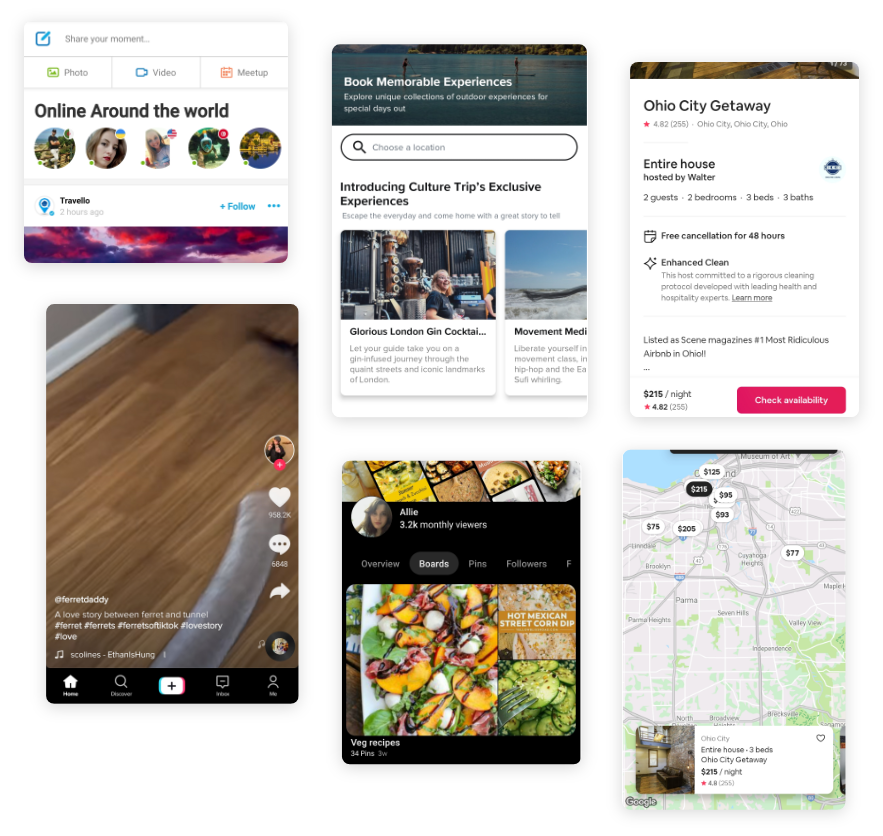
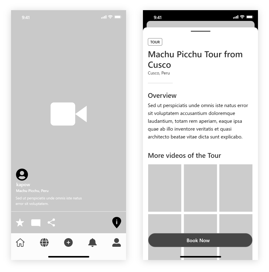
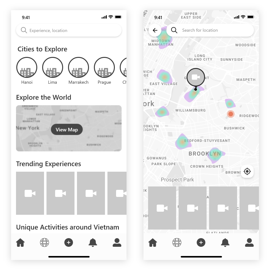
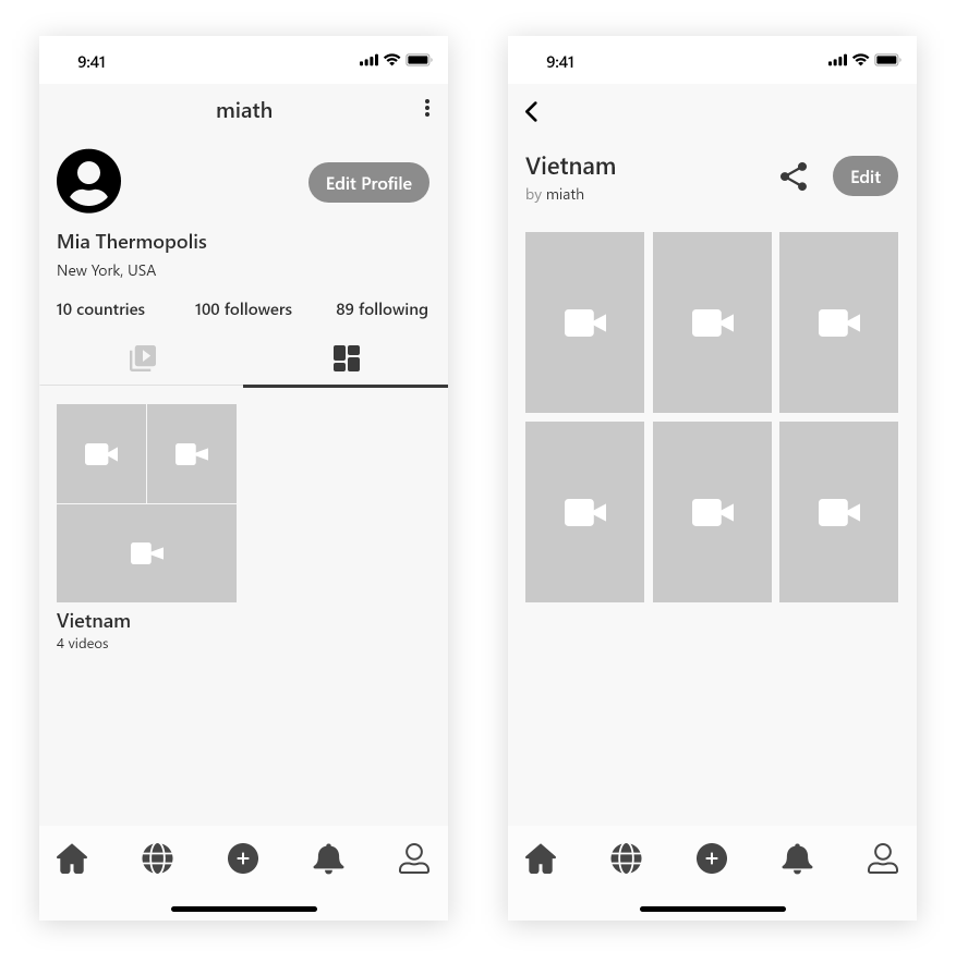
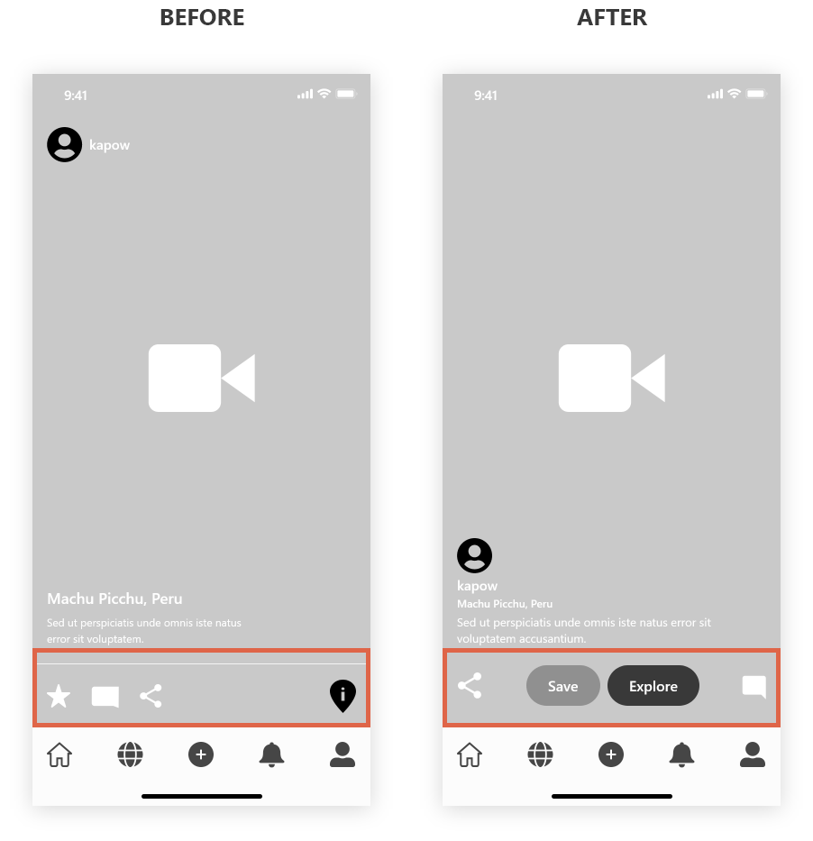
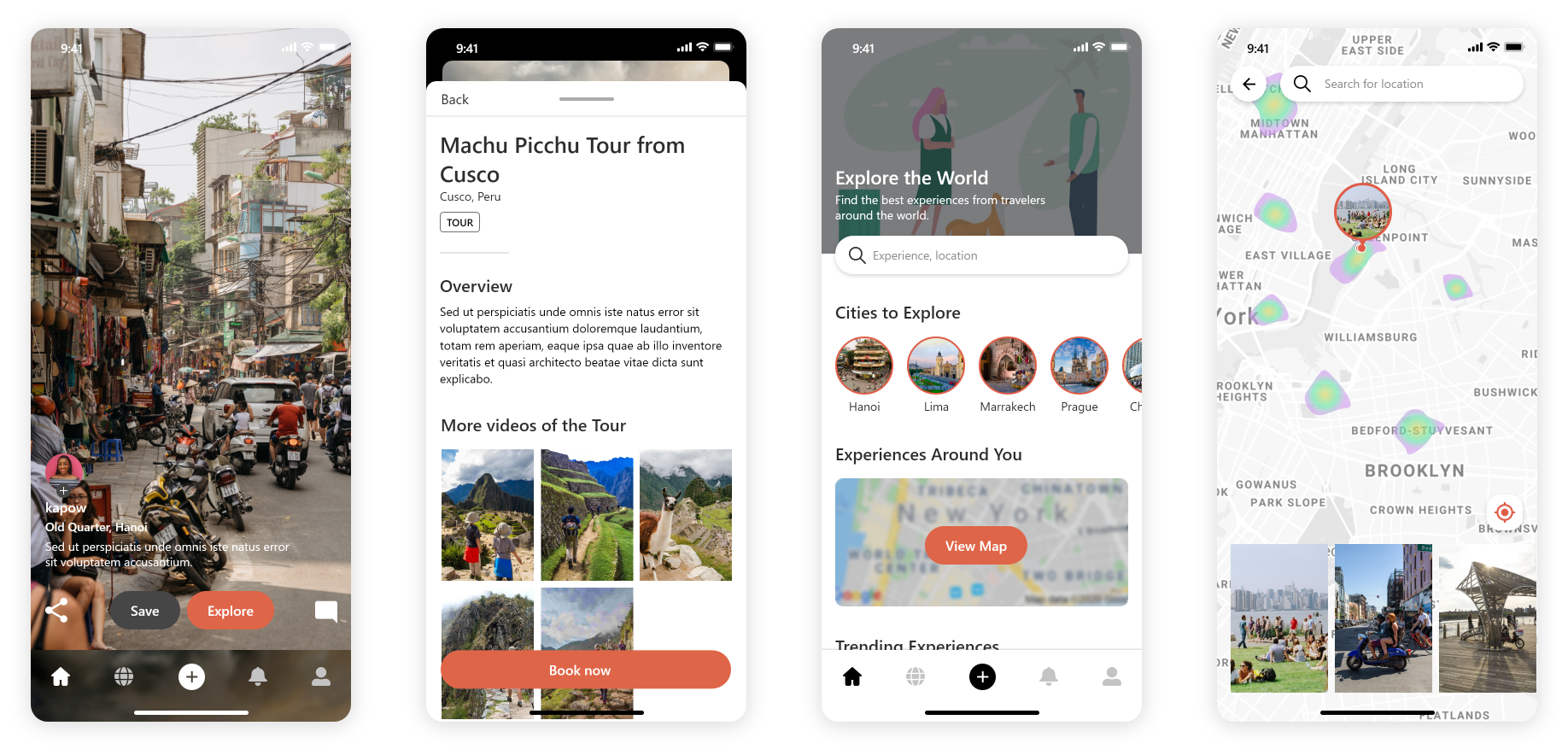
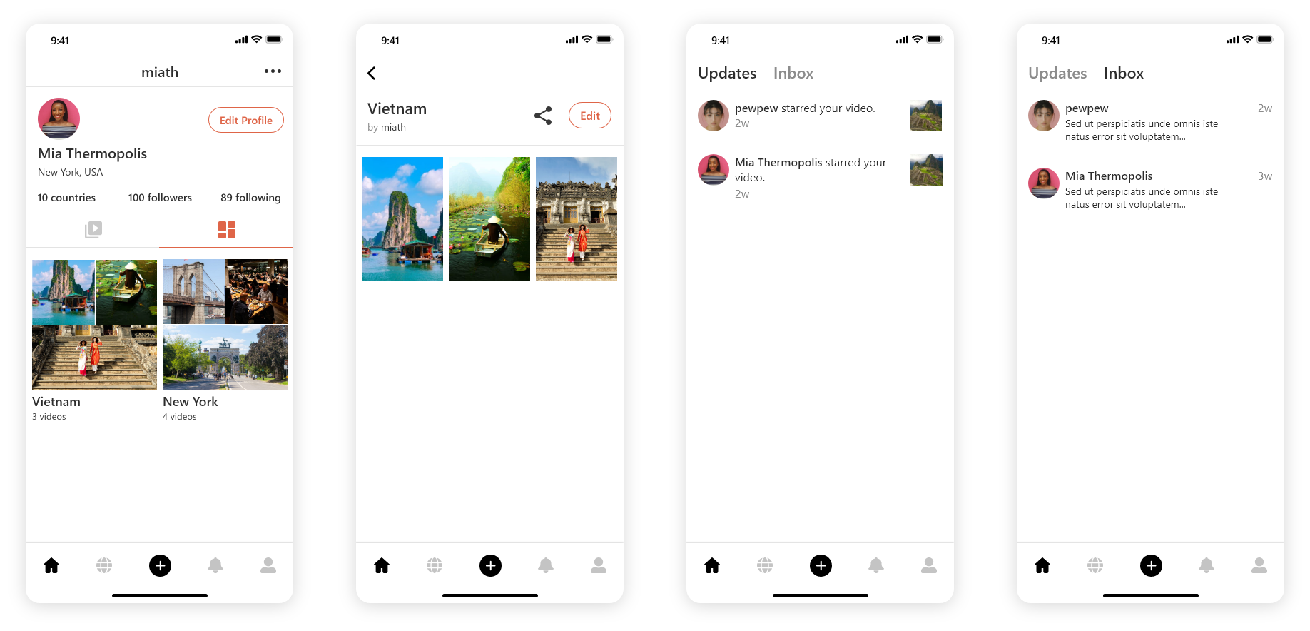
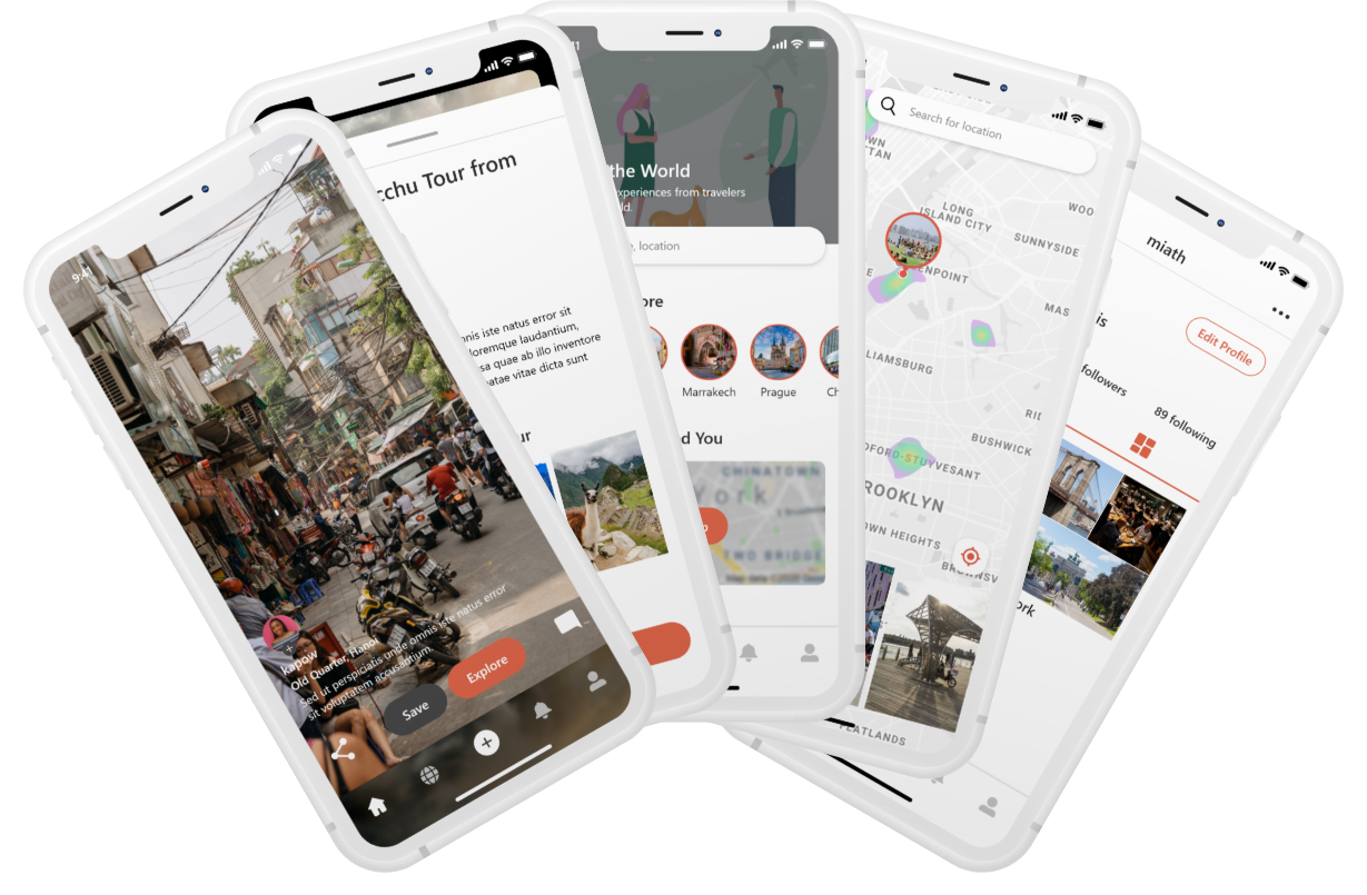
PeekTrip is an unique travel platform that allows users to discover new travel destinations through short-form videos. Users can save videos to personal travel boards and book experiences directly through the videos they watch.

Project Goal

Design a social networking app that helps users easily explore and share their travel experiences, as well as facilitate easy experience bookings.

ROLE

  • Sole UX/UI Designer

TASKS

  • UX Research
  • OOUX
  • Wireflow
  • Wireframe
  • Prototype

DATE

July 2019

DISCOVERY PHASE

Understanding the space

Nowadays, social media influences popular trends which includes new travel destinations. This is why it was important to utilize the social network aspect of this app as a vehicle for users to discover more unique travel experiences. This way, the app is not only used as a travel planning tool but also as an engaging social media platform catered to travel enthusiasts.

In order to develop a social networking app focused on travel, I needed to understand both the social media and travel spaces, and where they could best intersect. To do this I analyzed competitors throughout both spaces such as Pinterest, TikTok, Airbnb, Culture Trip and more.

Key findings:

  • Engaging content is the gateway for users to explore new destinations
  • Offer different discovery paths provides flexibility for the user
  • Personalization is crucial to enhance the users experience
IDEATION

Main features

Location Details

The detail modal allows users to learn more about each video's featured experience. Booking options are also available in the modal.

Map Integration

Users can interact with a heatmap to discover videos from selected areas.

Trip Boards

Users can save videos into their travel boards and make a personalized itinerary or a dream vacation list.

OBJECT-ORIENTED UX

Designing with objects in mind

Around the time I started this project I was reading up on Object-Oriented UX by Sophia V Prater. With the OOUX process, I prioritized identifying the main objects that make up this app, before focusing on flows and actions. This process helped me to ensure all the elements of the application work well together without creating accidental complexity of unnecessary design elements.

While working through this process I was able to uncover a couple of "entanglements". One is how to prioritize all the CTAs in the video. With as many as 4 CTAs it is important to properly prioritize the importance of each and translate it into the design. Another thing is the relationship between "Experiences" and "Location". In the beginning I only have the "Experience" object, however upon further consideration I thought that it would be useful to have a "Location" object which provides contextual navigation for the users.

USERFLOW

Mapping out the paths

After completing the OOUX process, I started creating a user flow to ensure I have all user interactions with the main tasks accounted for. The tasks include quick booking, saving to customizable trip boards, and finding an experience through different paths.

WIREFRAMES

Visualizing the layout

Before building the final design I created wireframes of the main screens. Here, I was able to brainstorm different layouts that could be the most intuitive for users.

Home

With the main goal of letting users explore locations and experiences in mind, tapping the "Explore" button will reveal a modal that provides the information of the location with an option to book the experience.

Explore Page

The heatmap allows users to explore all the "hotspots" around the world. When users tap on a "hotspot" the video selections will dynamically update to correspond with those "hotspots".

Travel Boards

On the profile page the user can also showcase their favorite videos on their travel boards.

REVISION

Give clarity to the main CTAs

After testing the wireframes with a couple of users, I learned that the video CTAs were not clear enough, specifically the Explore button. With that information I redesigned the action panel. The new design better prioritizes the two main CTAs of Explore and Save.

DESIGN

Final Prototype

Other Projects

---

Always open to new
opportunities.
Get in touch →