Back to top

OPPORTY

Creating a user experience that seamlessly connects users to trusted businesses.

Overview

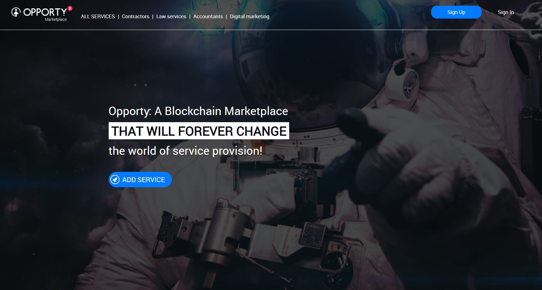
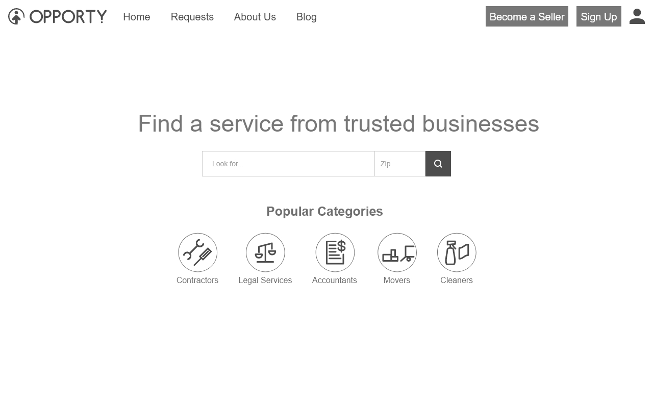
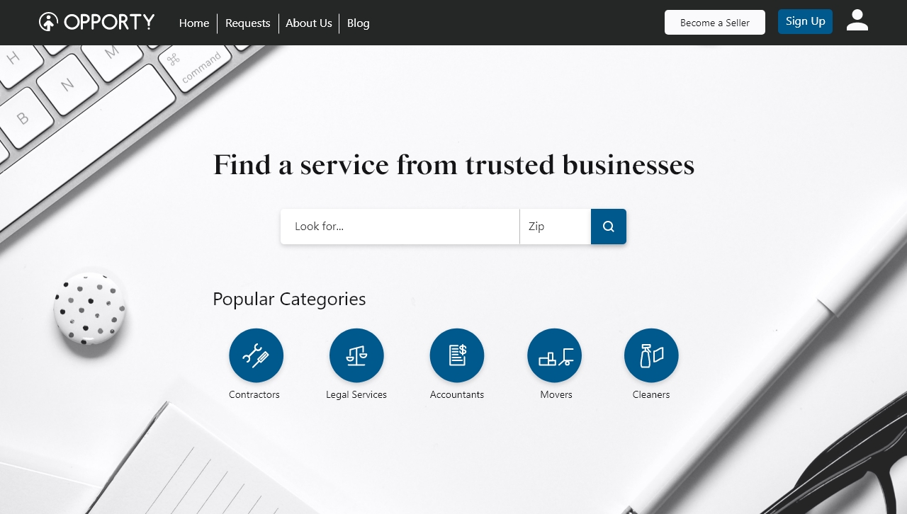
Opporty is an new innovative service marketplace platform that has a big potential. One of the platform’s key goals is to support businesses that are owned by or hire disabled, veterans, elderly, minorities and those coming from disadvantaged backgrounds. Opporty allows businesses to market their services while giving buyers an opportunity to find, research and order those services.

Project Goal

Our team's goal was to improve the user's experience navigating Opporty's online marketplace, by integrating features that differentiate Opporty from its competitors and align with Opporty’s mission of supporting businesses with social impact, all to increase user acquisition.

ROLE

  • UX Research
  • Strategy
  • Wireframing
  • UI Design
  • Protyping

TEAMMATES

  • Rosa Genetti
  • Yael Ezer
  • Eduardo Crespo

DURATION

3 months

Competitive Analysis

In order to understand more about the service marketplace industry we looked into Opporty's established competitors: Fiverr, Thumbtack, Handy, Upwork, Task Rabbit and Angie's List.
Main findings:

  • They all have a clear and concise value proposition.
  • Market is searchable from the homepage header either via a search box and/or category options.
  • There are generally 2 types of flows when searching for a service. The first one is displaying all the results of the user's search with a filter section to narrow down the results. The second one guides the user through a filtering process before showing the results.

User Research

User Interview

We set out to interview 6 potential users to gain insight into:

  • The user’s thoughts and processes when searching for services.
  • Social impact's influence on their decision making process when choosing a service.
  • User's familiarity with blockchain and their overall thoughts on it.
USER INTERVIEW FINDINGS
Pain Point

Users find that sometimes there were too little or too many options to choose from.

Device Preference

Users prefer using a computer for more in-depth research when looking for a service.

User Values

Users tend to most value the price of the service followed by reviews and evidence of work.

Social Impact

Users said that social impact does influence their final decision when mentioned.

Blockchain

Users are not familiar with blockchain and are doubtful about it.

Usability Test

We also designed a usability test of the current marketplace to gain insights into:

  • Users first impression of the marketplace and their experience navigating the marketplace.
  • User experience of completing the task of searching for a specific service in the marketplace.
USABILITY TEST FINDINGS
Confusion

The brand messaging is unclear. The term blockchain also added to confusion and doubtfulness in the platform.

Lack of Direction

The unclear CTA and navigation made it hard for users to start the process of searching for a service.

Design Improvement

Users did not think the sites design was up-to-date and this did not give them the confidence to use the marketplace.

Complicated Filtering

Users had trouble filtering the results due to the complication of the 2-level filtering system.

Research Synthesis

After going through our interviews and user testing we decided to create an affinity diagram in order to organize our results into main categories. This helped us with analyzing the findings by patterns and themes. As the diagram shows, we identified 4 main areas that needed to be worked on: Company Profile, Navigation, Messaging, and Search Methods.

Ideation

Following our synthesis process and analysis of our findings, we decided the following to be the main focus points for our design direction.

01
Clarify the Message

We decided to have a clear and concise message of how Opporty can help users. We also would not mention Blockchain since most users are doubtful of it.

02
Clear Call to Action

We will focus on providing the user a clear direction that will produce a friendly user experience and assist the user in reaching their goal quicker and more efficiently.

03
Simplify the Filtering Process

We would replace the current 2-level filtering process with a more simple standard filter bar.

04
Social Impact

We will include a section within the listing for applicable businesses to have their own social impact description.

05
Add Favorites Tool

Add a favorites tool that can help users with their decision making.

06
Focus on Desktop

Since users prefer using desktop to do more in-depth search, we decided to focus on the desktop platform.

Taskflow

In order to get a better idea of the specific steps the user will need to take to find a service, we created a userflow.

Wireframe the Solution

Homepage

For the homepage header we made sure to have a clear and concise message of the purpose of Opporty's website. We implemented a search bar so users can start their searching process with ease. We also included popular categories for users convenience.

IfItDoesntMatchAnyMedia

Search Results

We removed the 2-level filtering system and moved the category and specialty under one standardized filter bar. We also added more filter options for users to narrow down their search results. We included more information in the service quick view box and added a favorite button. The favorite list can accessed via the favorite button on top.

IfItDoesntMatchAnyMedia

Service Listing

We reorganized the listing page and improved the visual hierarchy of the information presented. We kept the search bar for the users convenience. We added a social impact section where businesses can add their own description. We also included reviews and star ratings that can help users with their decisions.

IfItDoesntMatchAnyMedia

User Feedback

We organized another round of user testing for our mid-fidelity prototype to validate whether our implemented solutions would solve previous problems.

IfItDoesntMatchAnyMedia
  • Clear Messaging. 100% of users were able to immediately understand what the website is for with no confusion compared to only 20% from the initial test.
  • Ease of Use. 80% of users were able to navigate the website using the search bar, navigation bars, and location search with ease compared to only 20% from the first test.
  • Social Impact. All users appreciated the social impact section within the service listing.
  • Desirable Feature Set. 90% of users were very intrigued by the ability to favorite listings.

Final Design

Style Guide

Aligning with Opporty's mission of social impact we really prioritized accessibility for our final design and made sure that it passes the WCAG level AAA conformance. We also picked colors that communicate the trustworthiness of the platform.

IfItDoesntMatchAnyMedia

Final Prototype

Reflection

The final design has been handed off to the clients development team. With more time with this project, we would keep testing new design iterations that can further improve the user experience. It is our priority to make sure that any new design iterations have the users best interest.

Personally this project has been a great learning experience for me. Since user research was extremely important for the success of this particular project, I had the chance strengthen my user interview and testing skills. I also learned a lot about collaboration and fostering a good team dynamic through open communication. Overall I believe our team were able to successfully solve difficult challenges through research and design.

Other Projects

Always open to new
opportunities.
Get in touch →