Back to top

Bagels & Co.

Creating a visually interesting restaurant website with an intuitive
online ordering experience.

Overview

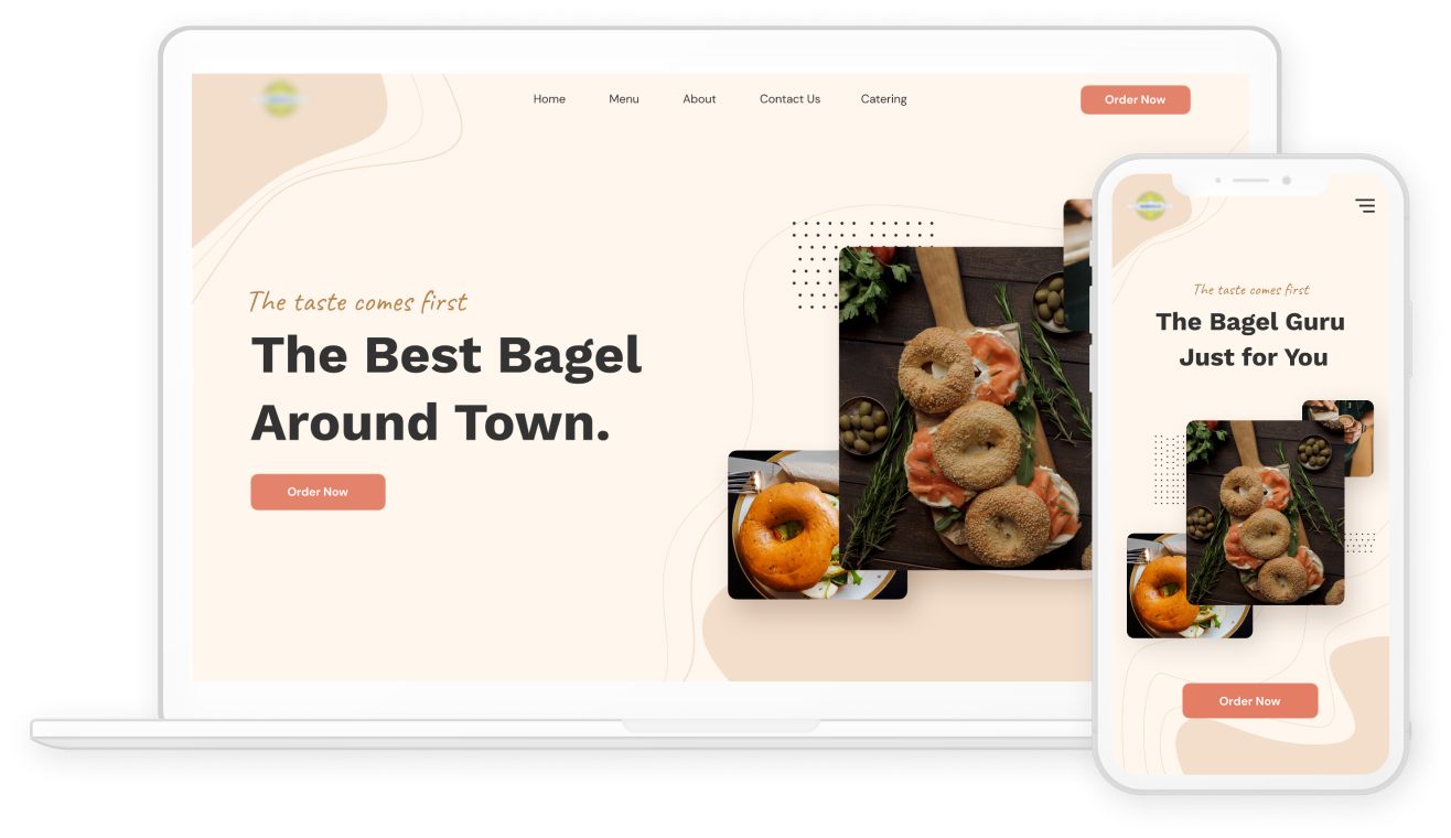
Bagels & Co. is a deli located in Manhattan that specializes in bagels and other deli staples. Along side with a website redesign they also wanted a custom built in-house ordering system to avoid high third-party commision fees and increase customer loyalty. I was responsible for the end-to-end design to revitalize their website and create the new ordering system, all within a tight deadline.

For this case study I mainly focused on the goals and solutions for the homepage and ordering system.

Project Goals

Homepage
  • Showcase the food and location vibe
  • Build trust with the customers
  • Key information is easily accessible
  • Clear call-to-action
  • Mobile Friendly
Online Ordering Sytem
  • Clear and efficient ordering process
  • Easy search and filtering options
  • Order tracking functionality
  • Mobile Friendly

ROLE

  • Product Designer

TASKS

  • UX Research
  • Wireflow
  • UI Design
  • Prototype

DURATION

3 weeks

Research Phase

Comparative Analysis

I began the process with identifying direct competitors to discover common features and see how I can differentiate Bagels & Co. from other bagel delis. I also wanted to gain more insight into different online ordering systems and understand how I can create an intuitive process for customers to order online.

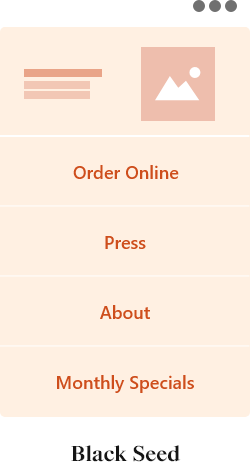
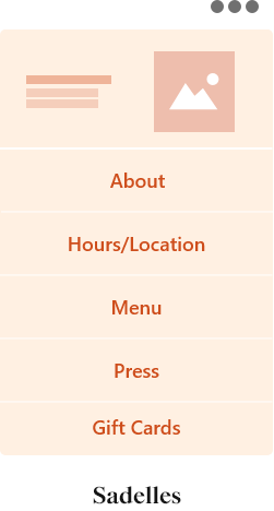
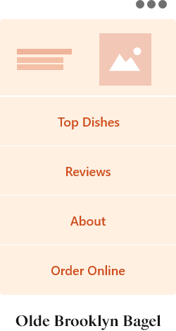
The direct competitors I identified were Black Seed, Sadelle's, and Olde Brooklyn Bagel. The key takeaway from this research was an understanding of what other businesses choose to highlight on their homepages. This was useful in creating a guideline for what needed to be included on Bagel's & Co homepage, and then aligning that with our main goal of a design that communicates their values and builds trust with the customers.

These are examples of competitor's homepage layouts:

To learn more about online ordering system I looked into UberEats, Seamless, and Caviar. I wanted to learn about their full ordering process, from choosing an order to delivery. Overall, the features are very similar across the platforms.

These are some of the highlighted features that I found across these platforms:

  • Pickup/Delivery Option
  • Item Customization
  • Order Tracking

User Research

I interviewed three users who frequently look up new restaurants and use online food ordering apps in order to gain insights into :

  • Why users visit a restaurant website and what type of information they expect the site to have?
  • The users thoughts and process while ordering food online.

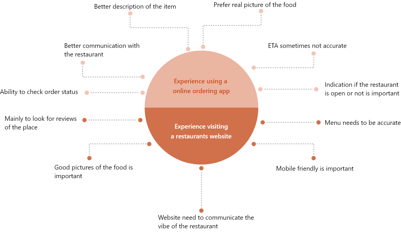
Below are some findings that I was able to gather from the interviews. The findings are extremely helpful for me during the design stage.

Homepage Design

Wireframe

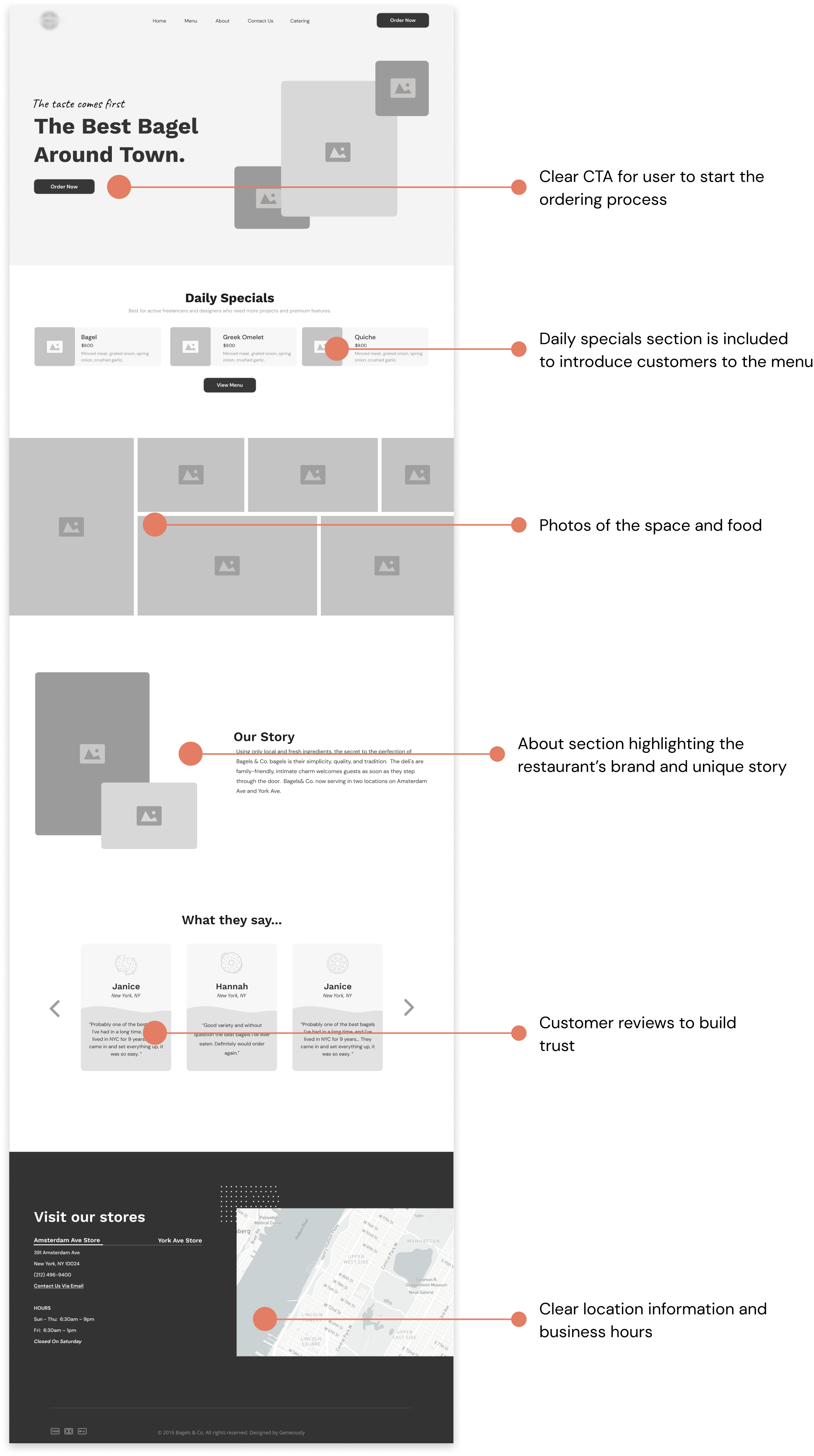
Based on insights from the comparative analysis as well as user research, I began the process of creating the wireframe for the homepage. I made sure the design and content addesses the user's needs.

Style Guide

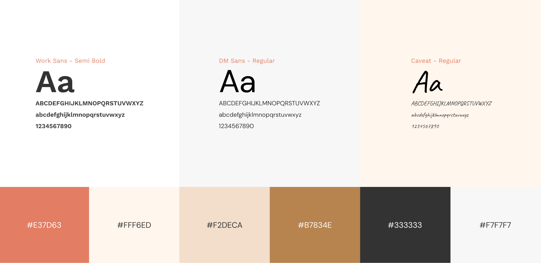
For the final UI design I implemented colors and components that are visually pleasing and communicate the vibe of the restaurant. The website also needs to responsible, since a lot of users prefer to order on their phones.

Final Design

Online Ordering System

Wireflow

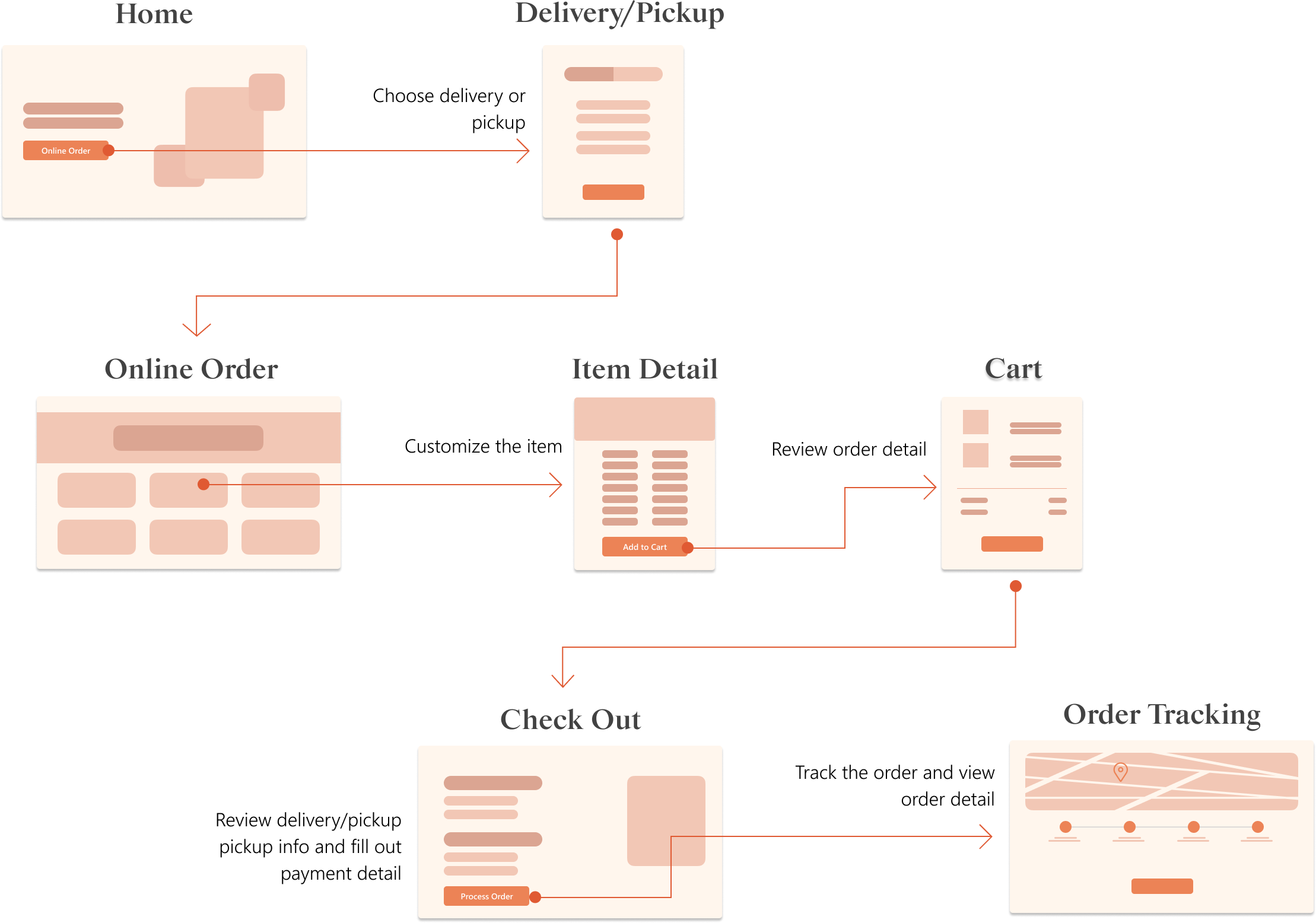
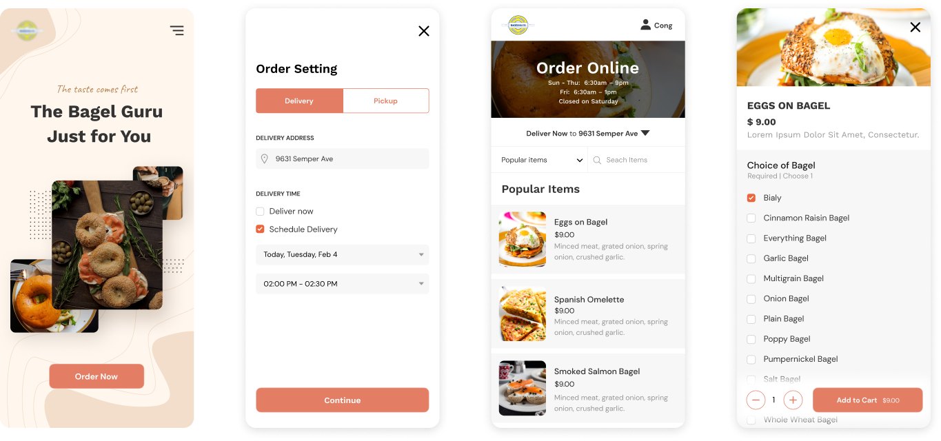
I started the design phase by creating a wireflow of the user going through the online ordering process. I made sure to include all necessary steps without overcomplicating navigation for the user. I also visualized the general layout of each screen for better context. On the Online Order page I made sure to have the store's hours for easy reference.

Final Prototype

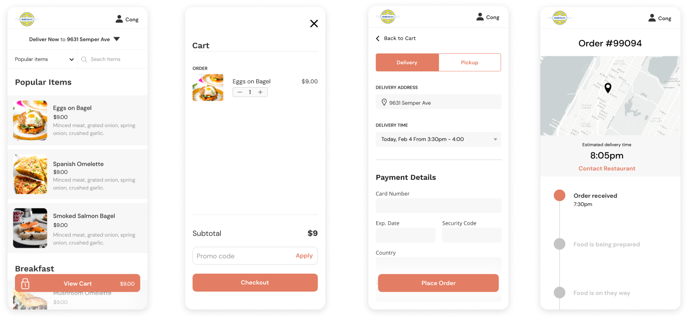
The completed ordering system provides a smooth process for the user from selecting their items to checkout and delivery tracking.

Other Projects

Always open to new
opportunities.
Get in touch →